If you’re a designer or even a business owner, you get how important colors are. Whether we’re talking branding or website design, every color you choose can have an impact on how you make people feel, and how people interact with your business.
If you’re building an app, it’s no different. In app design, colors matter. The color schemes and accents you choose have the power to make or break your user experience, like it or not. Color schemes are at the center of quality design, and it’s a step you don’t want to skip or choose arbitrarily.
App design color choices have the power to make the difference between an incredible user experience or an already forgotten one. From the beginning, you want to carefully consider and select the overall color scheme you plan to use in the design of your app, in order to maximize its potential. Every element should be considered, and here’s why.
One university study concluded that 62% to 90% of our snap judgements are based on color alone. Those are some substantial percentage points, and this represents a major opportunity to have a serious impact on the success of your app — before it’s even out there. I mentioned above that you’ve got to consider every element, and that wasn’t an attempt to be over-dramatic. If you want people to download your app from the app store, what colour should your logo and icon be? Research points to blue.
How Do Colors Make People Feel?
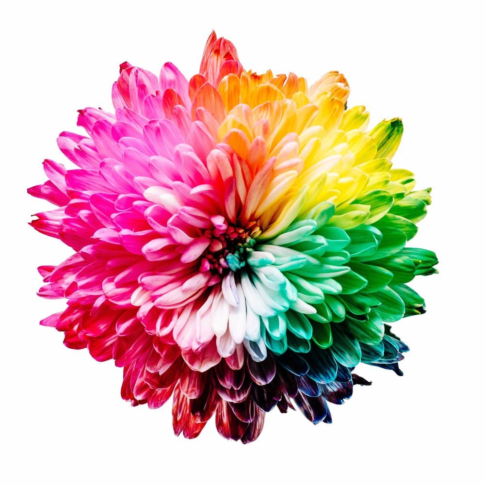
I won’t dive into the history of color theory or the color wheel, because the most important thing to get here is that you need to consider how different colors make people FEEL. That’s how you can ensure you elicit feelings that align with your brand, and avoid causing unwanted sentiments.
To get started, there are a few things you want to find out. Then, you’re ready to start researching and making some decisions about app design color.
What colors are your industry competitors using? What other colors could be associated with the problems you solve? What colors could potentially cause the opposite of what you’re trying to achieve?
Although there are countless opinions on this matter, and countless answers if you do a quick search on Google, here are the most commonly understood color emotions.
- ORANGE: friendly, cheerful, and confident
- RED: excitement, youthful and bold
- PURPLE: creative, imaginative, and wise
- YELLOW: optimism, clarity, and warmth
- GREEN: peaceful, growth and health
- BLUE: trust, dependable and strength
- BLACK/GREY/WHITE: balance, neutral and calm
If you think about your favorite brands, you can probably connect those exact feelings to your perception of them.
Once you understand your industry, category, and consumer preferences, you can start thinking about what look is going to make sense for your app design’s color scheme.
There are plenty of tools out there to help you with your color scheme. From things like color wheels to softwares, you’ve got your pick. Research shows that people prefer just a few colors, which has led to huge popularity for the monochromatic colour scheme. This is the belief that it makes sense to choose one primary color, and then use its tones, shades, and tints to pull in complementary colors.
There are countless ways to choose your app design color scheme, but the type of scheme you choose won’t be the most important. What’s essential here is that you start the design process of your app with a thorough understanding of your industry, and what the colors you choose make people feel.
Want to know more? Reach out to the experts here at Goji Labs and our talented designers can help you.
Post originally appeared on gojilabs.com.