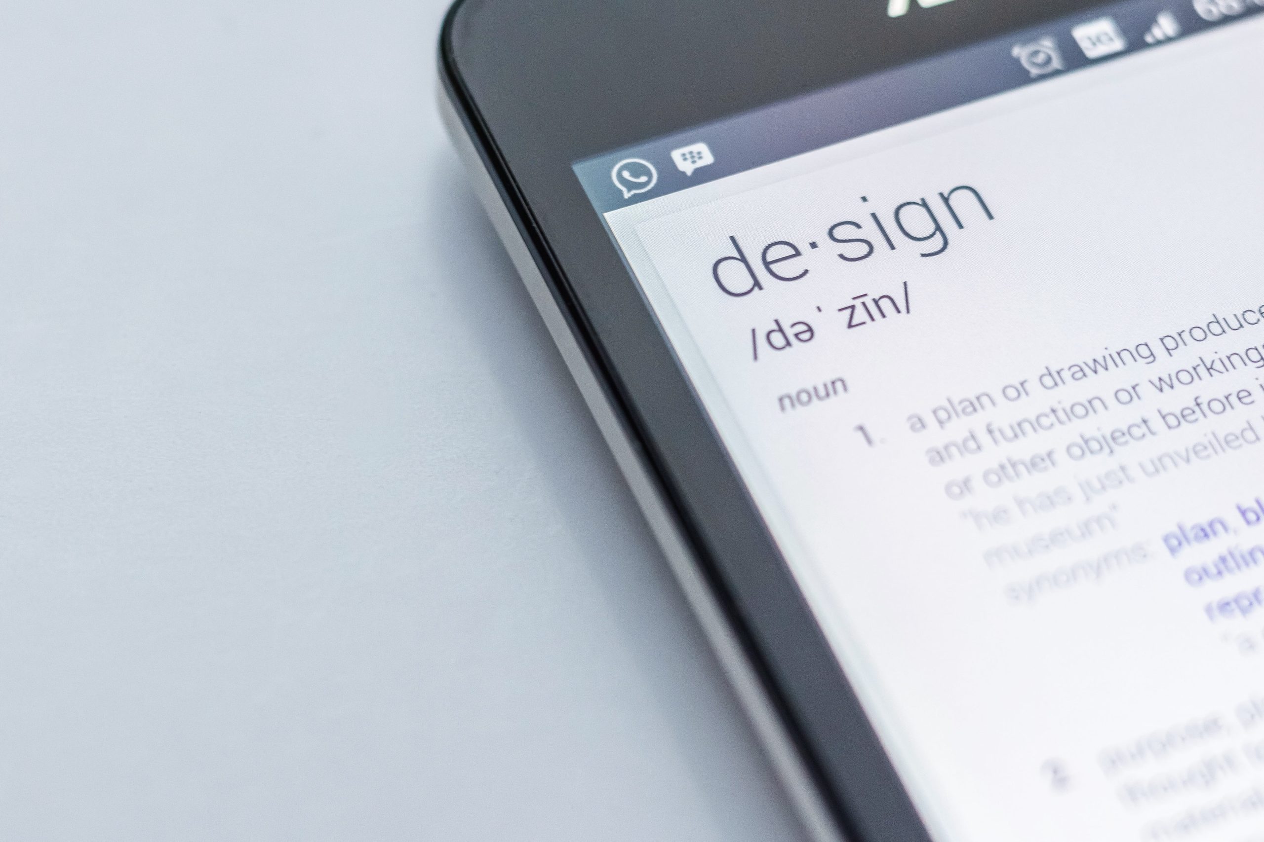
Design Psychology is when the principles of design and the principles of psychology are used together to affect how a person feels. For example, you sit down at a table at a fancy restaurant. You immediately feel relaxed, hungrier, and completely comfortable. That isn’t by accident – it’s by design. There is an entire field of study dedicated to understanding what happens when we intersect these two things, and how they can be used to affect feelings and behaviors.
Now, we’re not talking about manipulation, trickery, or anything sinister like that. The goal here isn’t to trick people into doing what you want, but to create the foundation – to set the mood – to help steer them down the conversion path.
How You Can Drive Conversions
Here are TWO of the most commonly used design psychology tactics used to help drive conversions.
REDUCE THE COGNITIVE LOAD
I won’t use the old goldfish analogy, but it’s no secret that human beings only have so many cognitive resources to go around. Your design should use models that are familiar and common, so that you’re not making people think any harder than they have to.
For example, logins, search queries, and shopping carts all typically perform a certain way. If you don’t match what people are expecting, it slows them down and makes them think. Sometimes, we just can’t handle taking anything else on in that exact moment, and something unfamiliar can be enough to derail what was going to be a conversion.
Specifically with ecommerce sites, people are often action-oriented. They are looking to perform one specific task, which is to make a purchase. You want to make that process as easy and intuitive as possible for them, highlighting the features or buttons they need to click in order to proceed.
UNDERSTAND CONSUMER EXPECTATIONS
I mentioned above about the importance of giving people what they expect so that they don’t have to think too hard, but there is another crucial element to this point, and it’s arguably the most impactful element of design psychology.
What sites do your customers spend the majority of their time on, and what apps do they use? If you want to compete and keep their attention, you’ve got to give them the experience and flow they’re used to. They expect things to operate a certain way, and you risk killing the conversion if you stray.
And the reason why is actually quite simple – if you want people to stay focused on making a purchase, or be able to find that exact product they are searching for, you need to let them focus on that task alone. Everything they need to do in order to achieve their desired result should be intuitive, familiar, and not require their attention and focus.
While there are countless strategies to try, these two are the ones you want to ensure you nail.
Don’t make people think too hard, and give them what they expect. This will allow them to stay focused on buying from you, and not force them to use their limited cognitive resources on things that should be simple.


