Breathing new life into an online dating game show
Platforms
Mobile
Deliverables
UX Audit, Product Strategy,
Branding, Visual Design

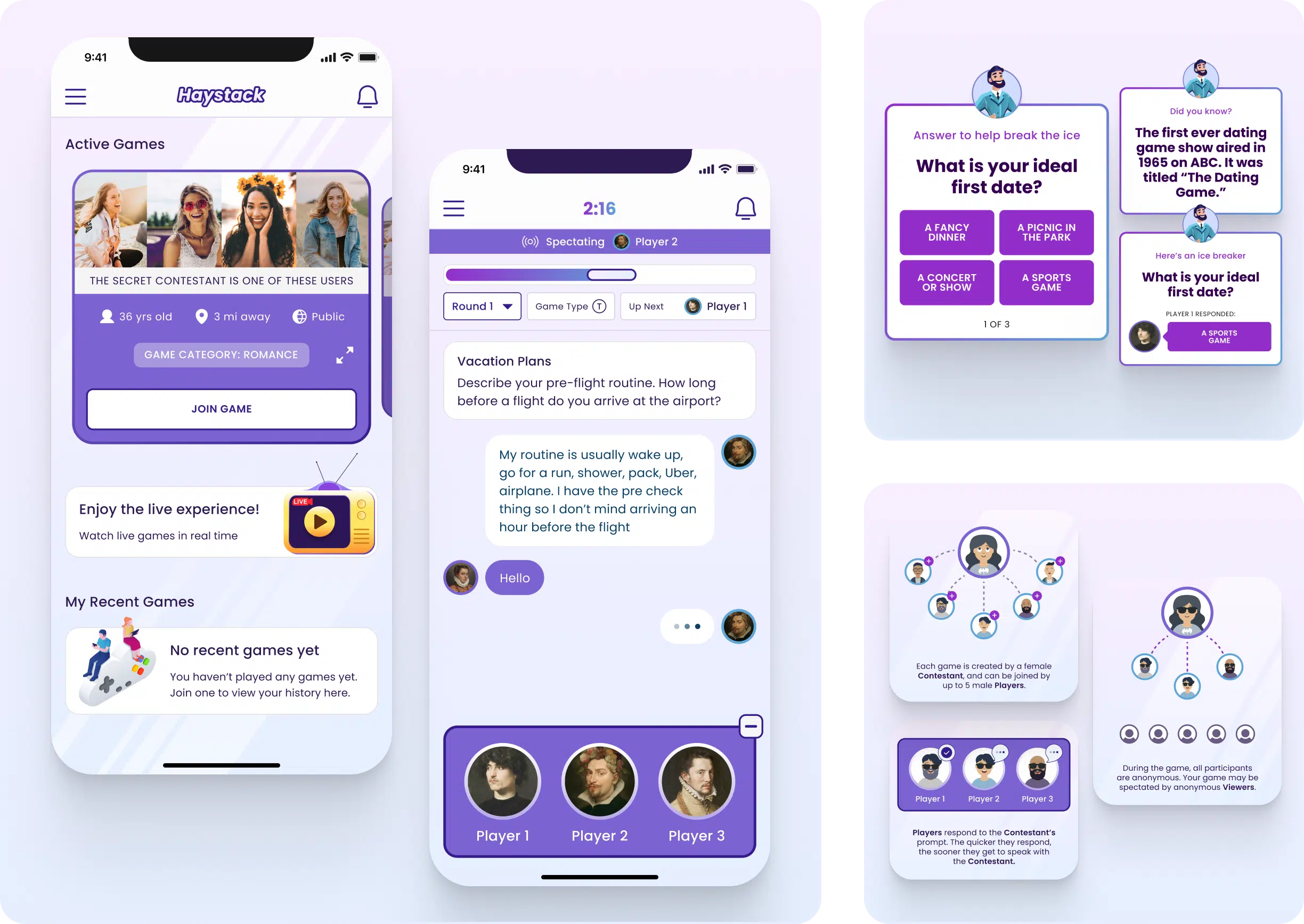
A one-of-a-kind online dating experience
Our client came to us with an idea to shake up the dating app world with a fun-filled game show twist. But there was a problem – the app’s initial version for iOS wasn’t hitting the mark when it came to user engagement and experience. They aimed to reduce abandonment rates, make the app user-friendly for new users, and create a comfortable and enjoyable experience for daters. How could we make the experience engaging and intuitive so that users could focus on connecting with each other while having fun? That’s where we stepped in.
Our mission was to help transform Haystack, the dating game show app, into a captivating and immersive experience that users couldn’t resist. And we were more than ready to take on the challenge.
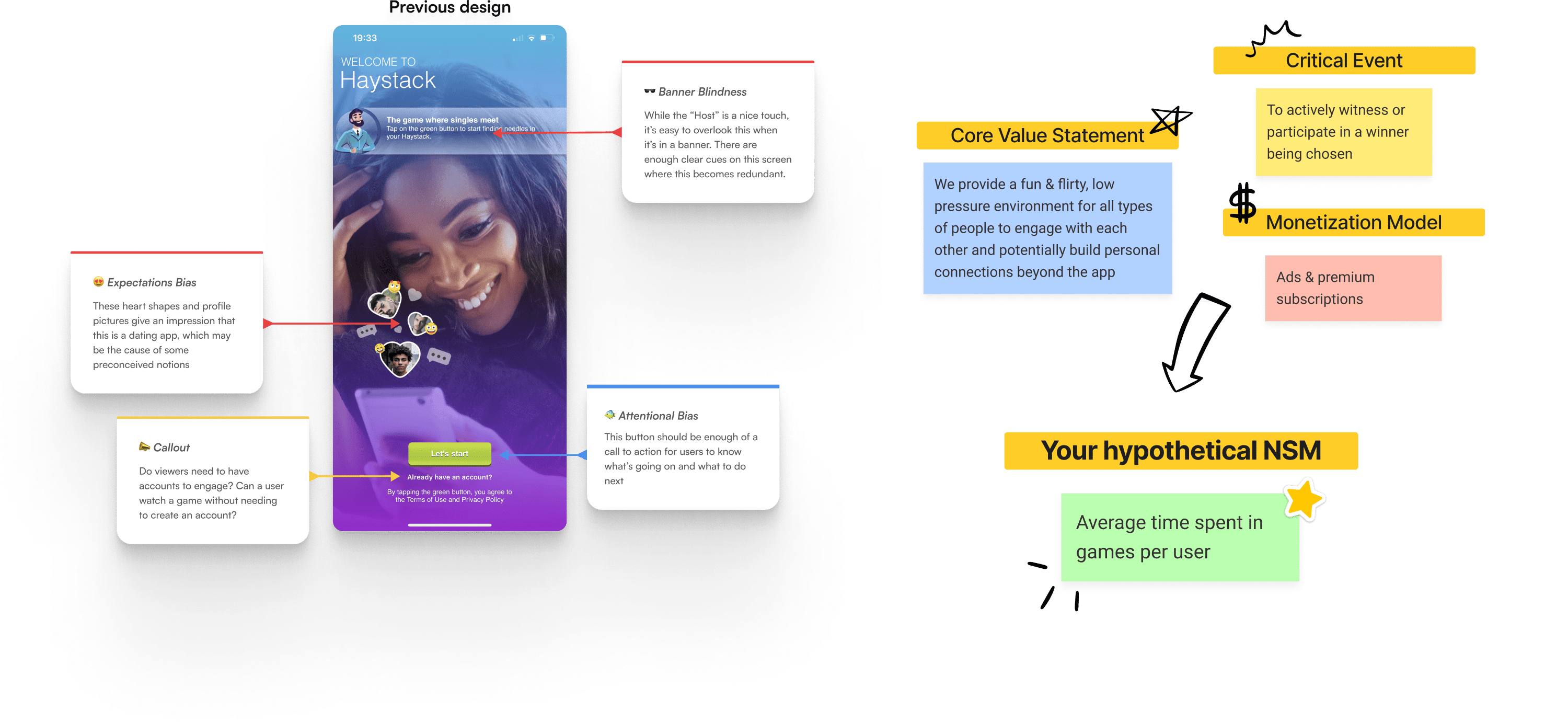
Identifying areas for improvement
The first week of our engagement was dedicated to learning the ins and outs of the existing Haystack product. Together, we ran a series of workshops to identify where we could improve the user experience and make the app more user-friendly. To guide our design decisions, we also zeroed in on a “north star” metric – a guiding light that would drive all our design decisions and help us create an app that users would love. We knew that keeping users engaged and coming back for more was key, so we measured time spent in games.
But we didn’t stop there – we conducted a design audit to get an even deeper understanding of the app’s strengths and weaknesses. With the user and client perspectives in mind, we identified some areas that needed improvement and some areas that were already doing well. Armed with this knowledge, we were able to make informed decisions on how to redesign the app for maximum impact.
Building a prioritized roadmap for the future
After our discovery workshops and UX audits, we got together and crafted a list of features to launch the MVP with a bang. We focused on making the onboarding process smooth and simple with an intuitive interface and guided walkthroughs. We also had some neat tricks up our sleeve to keep users engaged during in-game wait times, like responsive ice breakers to encourage people to interact with each other during the game.
To make sure everything was on track, we considered factors like development effort, design time estimates, and our north star metric. We then sorted features into four levels of priority with both short-term and long-term recommendations. This way, our client had a roadmap for ongoing improvement, while still delivering an MVP that meets user needs from the get-go. We’re thrilled with how we struck a balance between launching an MVP that’s top-notch and setting the stage for future growth and success.
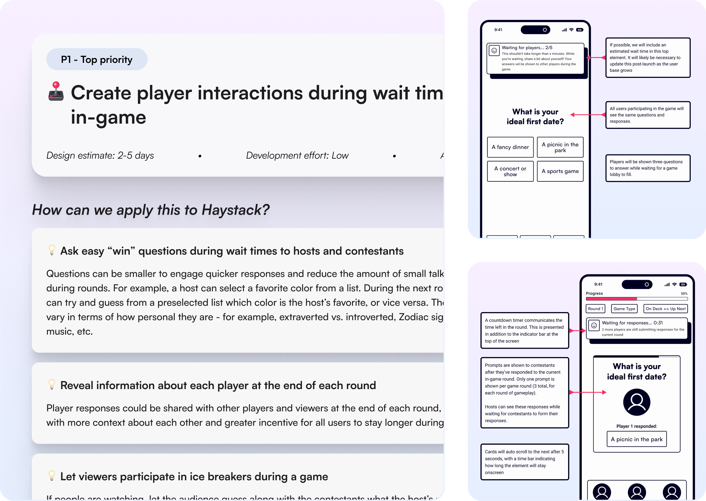
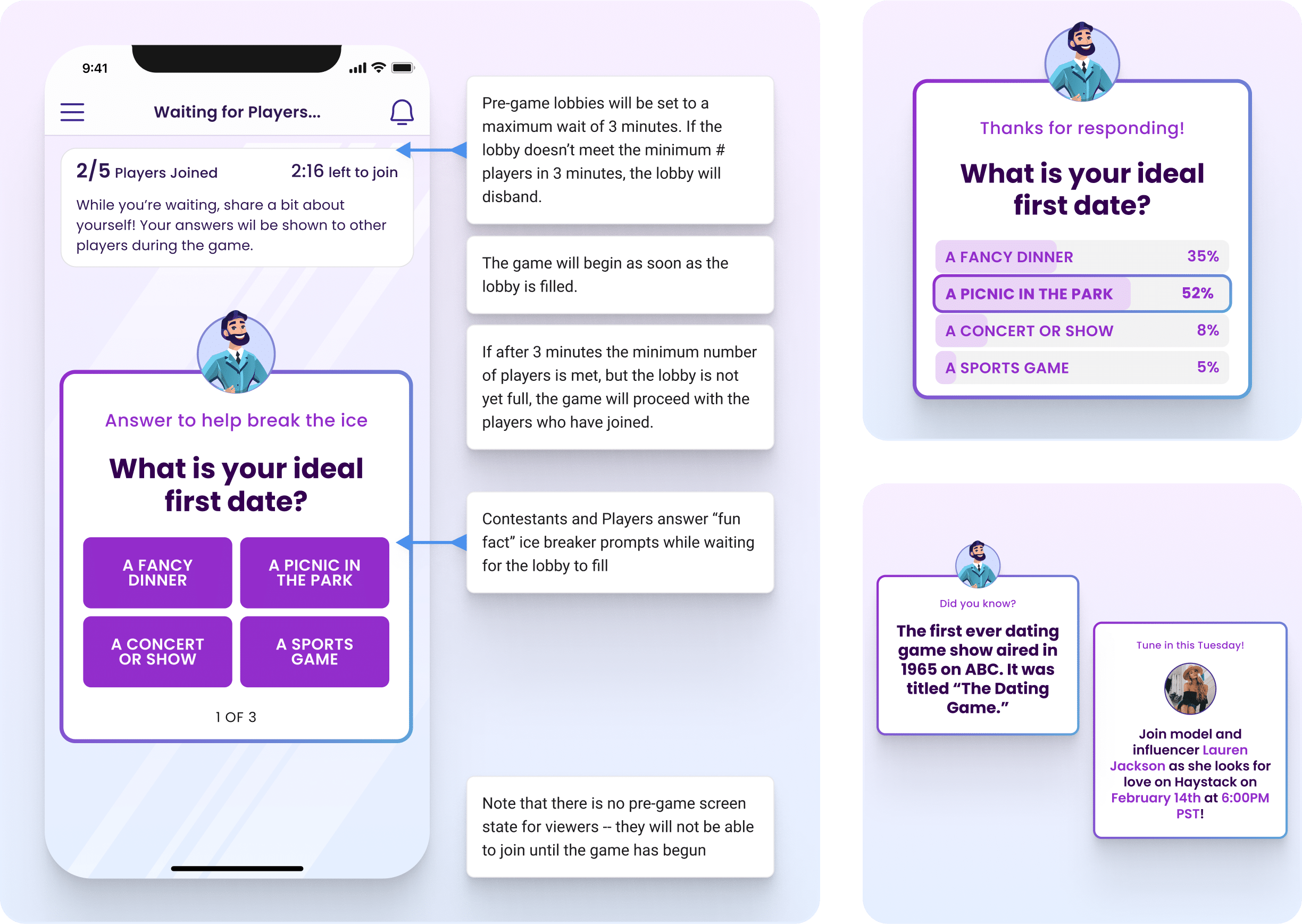
Filling wait times during gameplay
Another challenge we faced was keeping users engaged during in-game wait times. Given Haystack’s live gameplay, lulls were unavoidable as users waited for others to submit responses or make selections during each round. We needed a way to hold users’ attention during these moments, so we took it upon ourselves to design a feature that could accomplish this while also supporting Haystack’s primary goal: bringing players together by helping them get to know each other better.
Our solution was a “Fun Facts” feature that would allow users to share details about themselves while waiting for each game to begin. Questions like “What’s your ideal first date?” would give players a chance to get to know each other, and provide topics for conversation during games. To round out the experience, we also included trivia cards about past dating game shows and advertisements for upcoming Haystack events.
Designing a modernized, yet familiar, visual brand
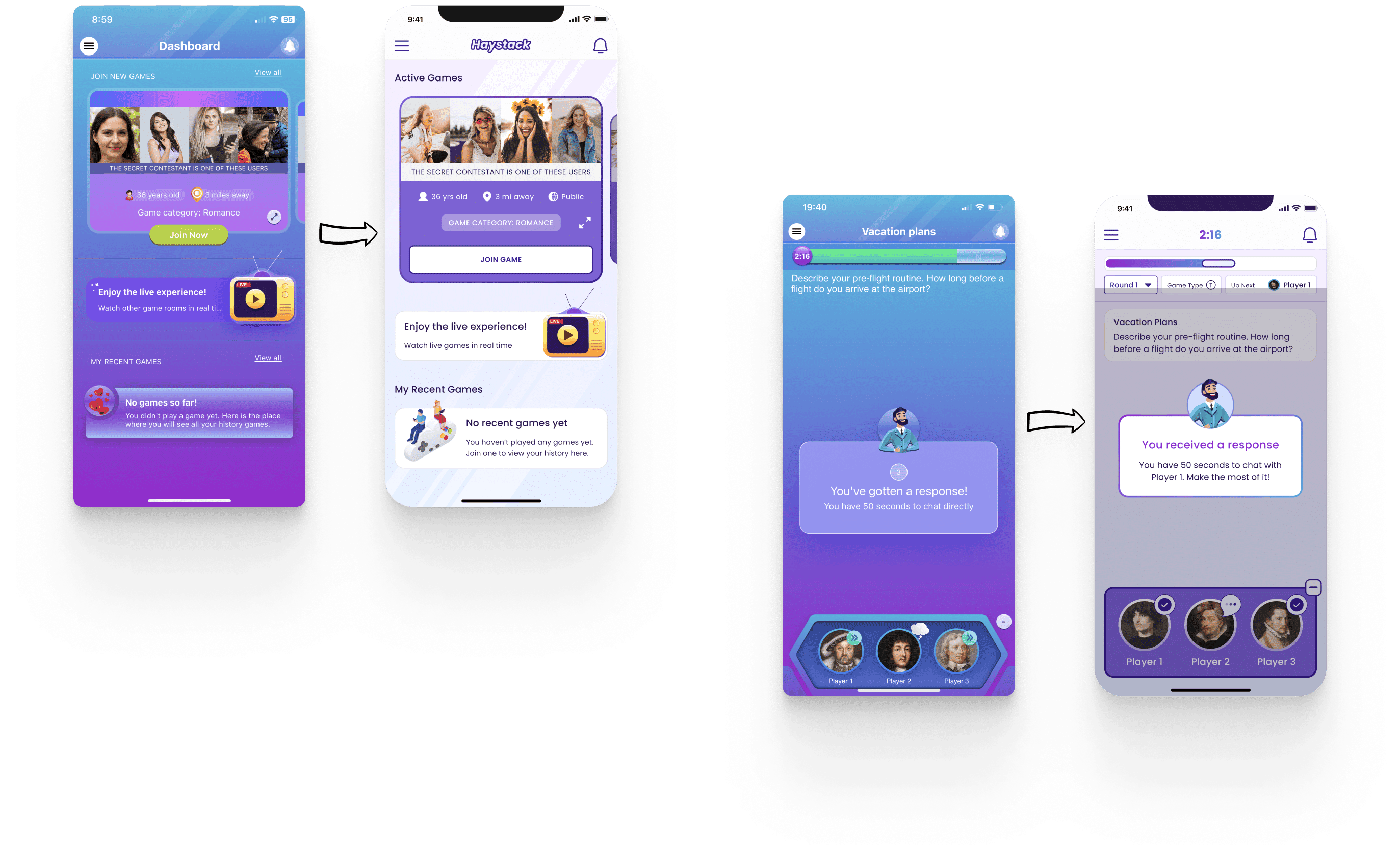
When Haystack first came to us, we quickly knew that their visual design and overall brand identity would be a major area for improvement. The app felt cluttered, overwhelming, and frankly, a bit outdated. We tackled the challenge head-on and focused on revamping the onboarding, main dashboard, in-game, and settings flows – the bread and butter of the Haystack experience.
Our main goal was to create a modern, minimalist aesthetic that didn’t compromise on Haystack’s fun and playful identity. We made sure to retain their signature purple-blue color palette and playful illustrations, but incorporated them tastefully as we built a cleaner, more readable interface. We also paid close attention to text hierarchy, so that everything felt cohesive and easy on the eyes. The result? A slick, intuitive, and visually-pleasing user experience that we’re incredibly proud of.
What next?
We’re proud of all the hard work we’ve done to bring Haystack to the next level, and we’re confident that the changes we’ve made will help establish Haystack as a unique entry into the world of online dating. The app is currently being developed by Haystack’s internal team, and we can’t wait to see our vision come to life.