Creating a comfortable enrollment experience for users in need
Platforms
Responsive Web
Deliverables
Research, UI, UX, Product Strategy,
Design System, Development

Delivering premium wireless services, for free
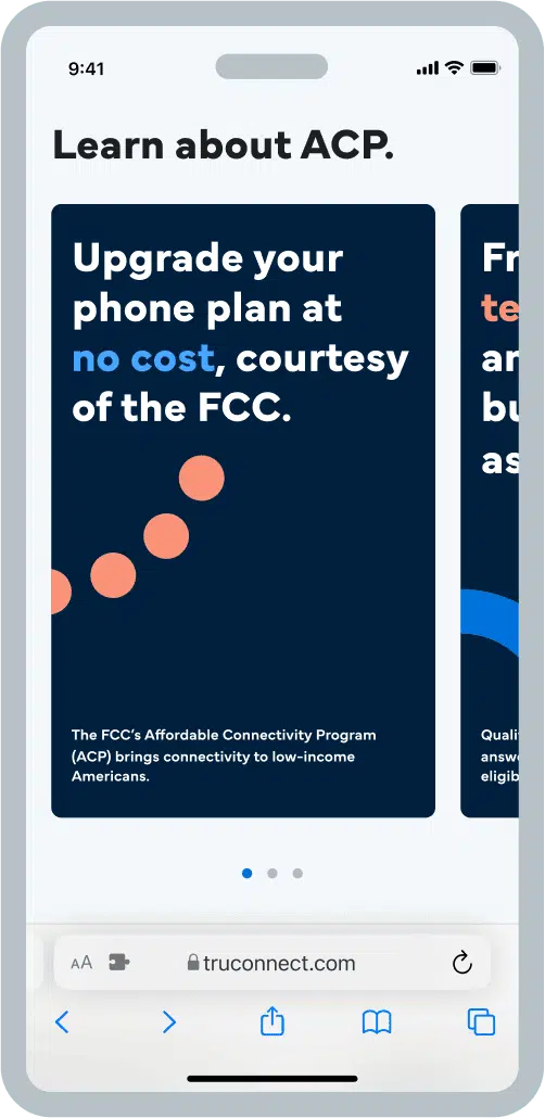
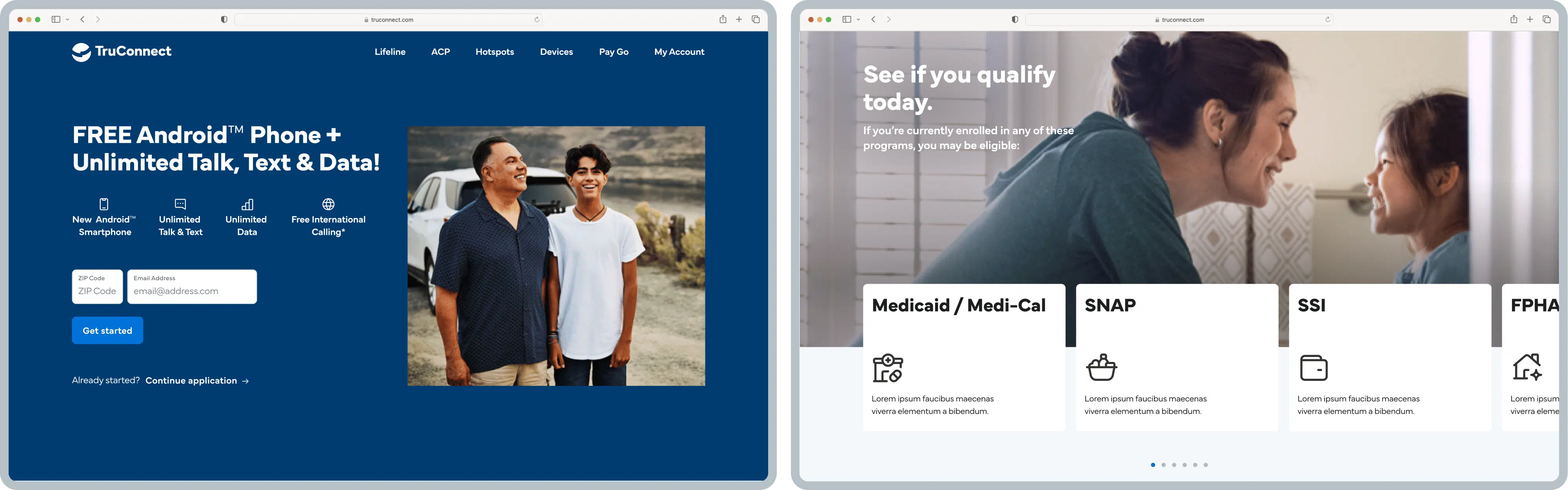
TruConnect is a wireless service provider that offers free cell service and phones to eligible participants of government programs like Lifeline and the Affordable Connectivity Program (ACP). But they were having trouble getting people to sign up.
Their onboarding platform, the Order Entry Portal (OEP), was clunky, confusing, and not very visually appealing, which was causing frustration for users and affecting enrollment rates. That’s where we came in. Our team took on the challenge of making the onboarding process for TruConnect easier and more enjoyable for users. Our goal was to streamline the process, make it simple and visually appealing, and ultimately improve customer satisfaction and retention.
Unpacking why users are struggling
When we audited TruConnect’s marketing and onboarding process, we realized there was room for improvement. Not only did they need to do a better job of conveying the benefits of their service, but they also needed to help potential customers feel more open to completing enrollment. To get to the root of the problem, we recruited five people who represented TruConnect’s target audience and conducted moderated usability tests.
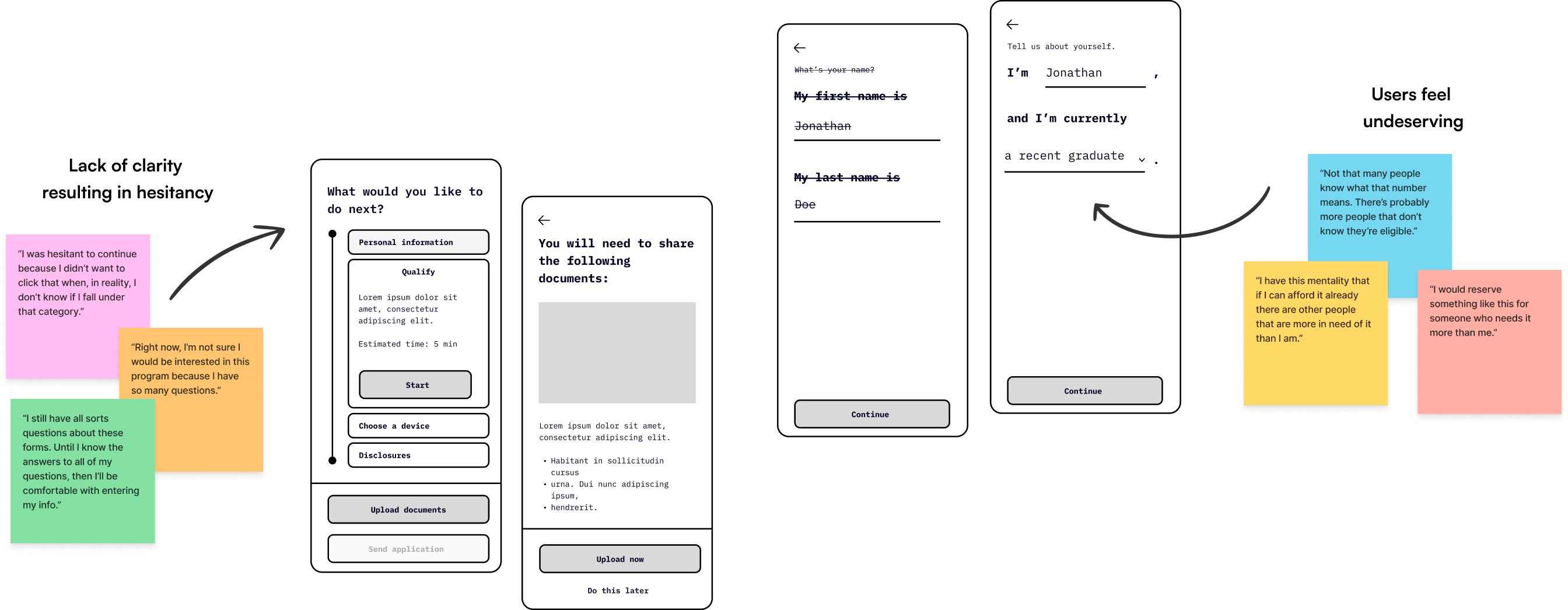
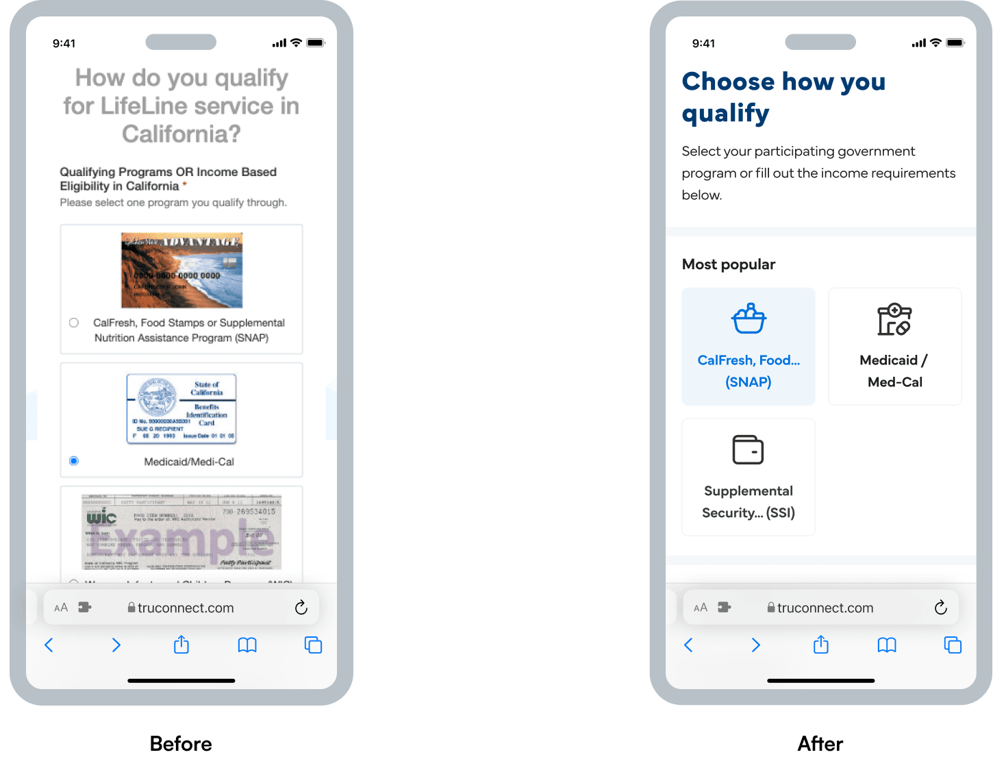
What we discovered was that people were uncomfortable with the enrollment process for more than just the visual layout of the Order Entry Portal (OEP). They didn’t feel seen in the criteria that actually applied to them, and they felt pressured when submitting personal information. It was a touchy subject for some.
Breaking down hesitations and enhancing enrollment
After speaking with users, we discovered that many people had negative preconceptions about government assistance when they began filling out the enrollment forms, which affected their overall experience. Some felt undeserving of government services, which caused them to dismiss their eligibility and view enrollment as an act of charity.
We also discovered that the technical jargon and warnings in the portal caused users to feel rushed and stressed. They were worried that making a wrong decision or taking too long would cancel their current plans. All of this made users hesitant and unsure about what to do next.
Mapping the way to a personalized experience
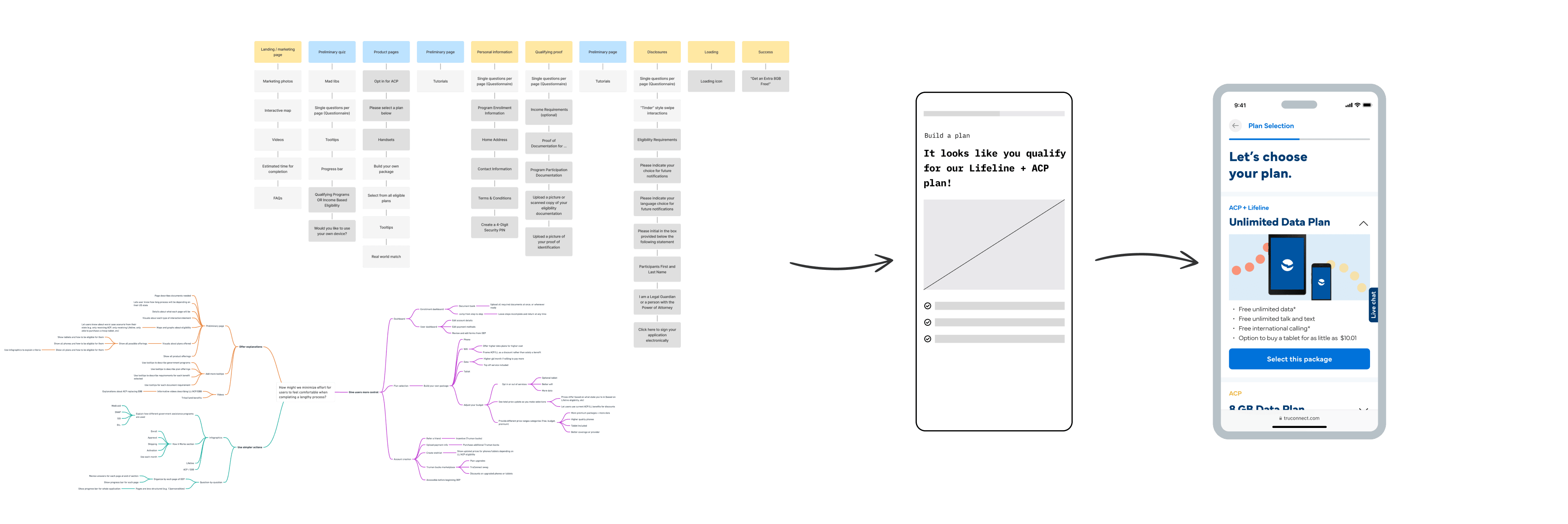
After gathering insights from research, we brainstormed potential features, pages, and other additions to the OEP by performing a mind-mapping exercise to explore varied solutions to the project’s challenges. With the features and pages hashed out from our mind-maps, we built information architecture and low-fidelity wireframes to visualize how we could repurpose the existing flow into a more logical order that mediated user pain points that were uncovered. We also edited the language in text forms to make it feel less governmental and more inclusive, in addition to revising visual hierarchy to create a more comfortable experience for users who are submitting potentially sensitive information.
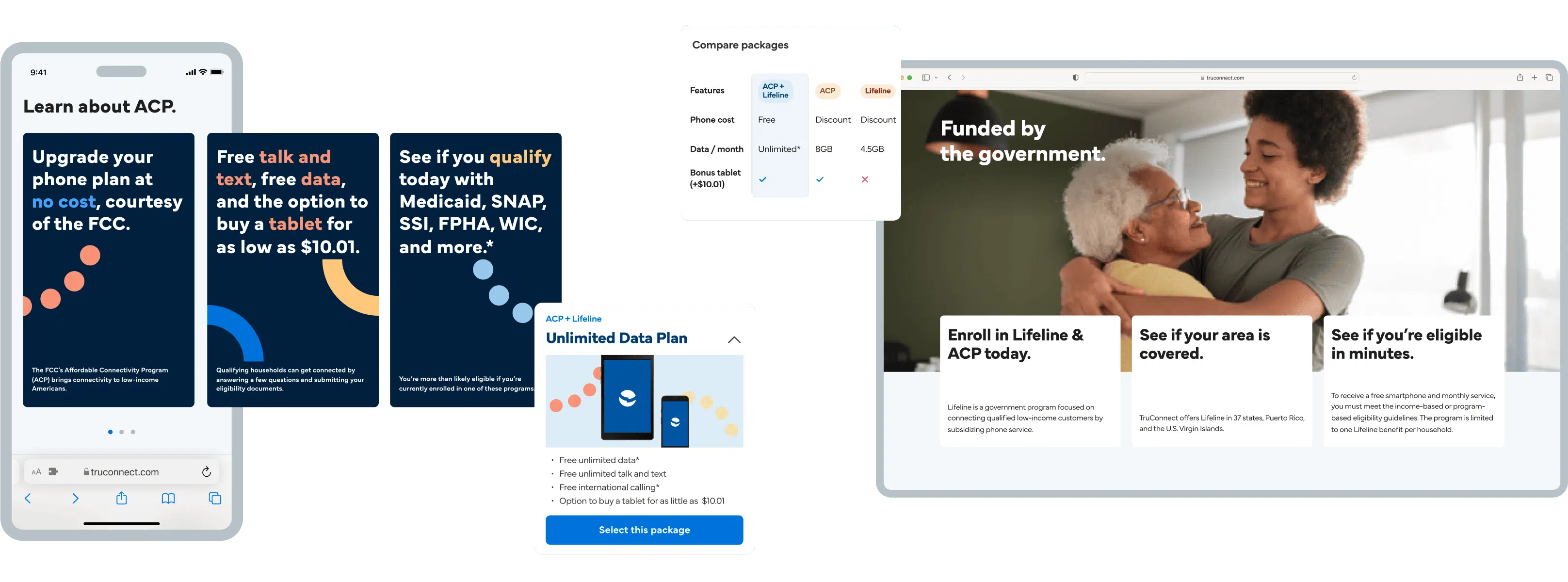
To bring our wireframes to life, we embarked on a UI exploration and applied various aesthetic approaches to settle on a final direction that best represented the brand within our user interface. We utilized TruConnect’s brand colors, typefaces, image assets, and icons to craft a cohesive visual experience for users.
Compliance meets simplicity
After we gave the onboarding process a fresh new look, the next hurdle was figuring out how to comply with government regulations while keeping the amount of information we presented to users manageable. Which parts of the process had to happen in a certain order? What text could be trimmed down, and what phrases or concepts were necessary? Which third-party APIs were necessary for each enrollment step?
To answer these questions, we conducted a series of workshops with TruConnect’s compliance, development, and marketing teams. This allowed us to pinpoint the requirements and arrive at a finalized flow that met all of these constraints.
Bridging the digital divide
We took on the challenge of making TruConnect’s services more accessible and user-friendly for everyone. We wanted to make the enrollment process as easy as possible, so we created a conversational experience that’s a breeze to understand. We also shook things up by reordering the questions to build momentum, and developed clearer goals for enrollees. Our goal was to help the underserved feel more connected to their community through technology, creating a sense of unity and empowerment.
After launching the designs, our collaboration with TruConnect didn’t come to a halt. We’re determined to keep working with them to keep enhancing the overall experience of their product and keep making a meaningful difference in the lives of underserved communities. The final designs are set to go live by the end of 2023, and we can’t wait to see the positive impact they will bring.