Interactive digital car tours to help travelers along their journey
Platforms
iOS
Deliverables
UX Audit, Design, Development

Road-tripping for millenials
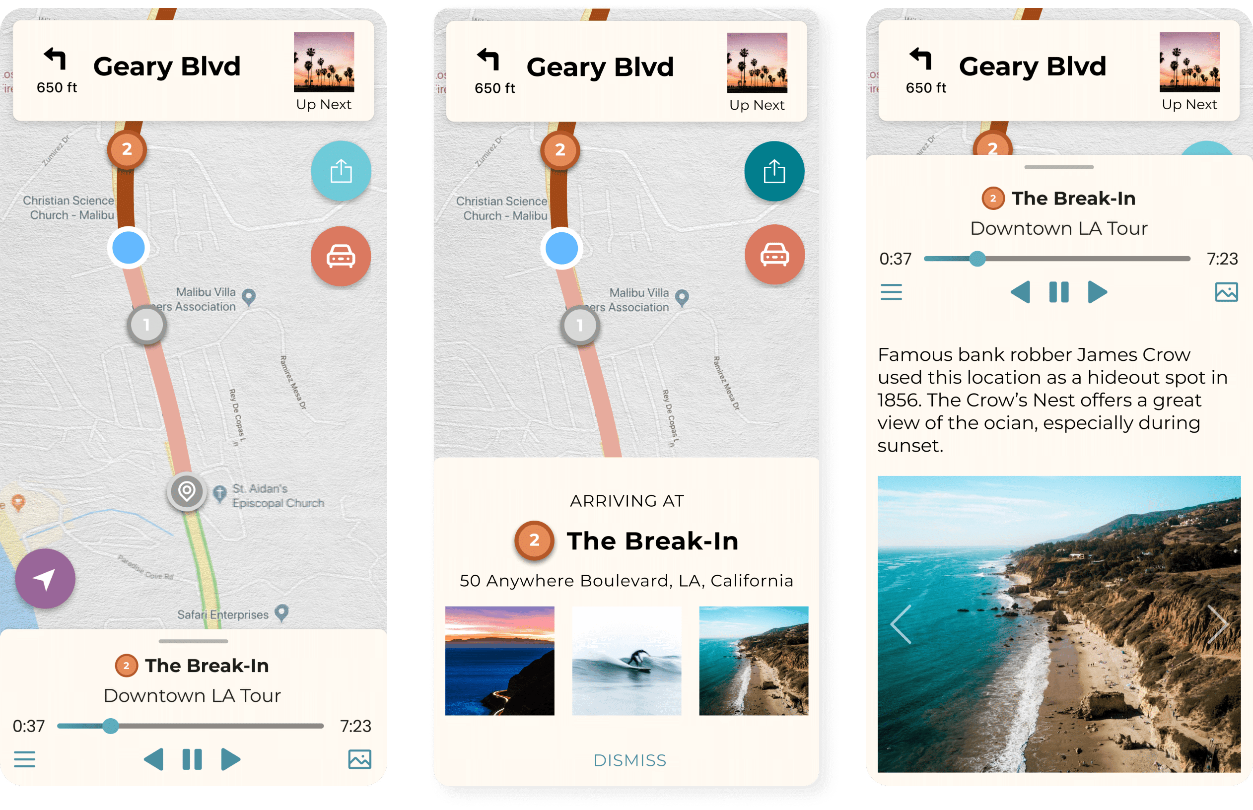
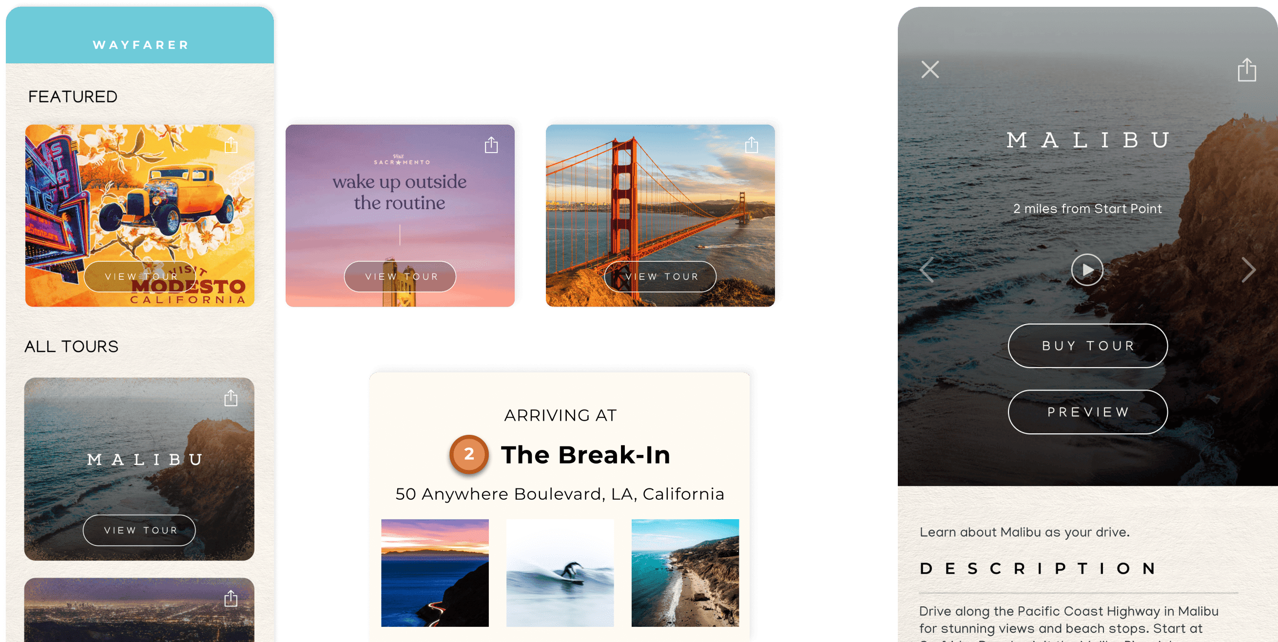
Wayfarer is an app for road-trippers featuring well-produced and locally curated audio driving tours of some of America’s most beautiful cities. Travellers can drive along a route set by the app’s navigation system and hear stories about stops along the way that play as the user approaches a destination. When the team came to us, they were looking to identify and correct design issues in the navigation screens of the app.
We started by conducting a heuristic evaluation of the app to identify key areas of weakness in terms of usability. There were issues with ambiguous buttons and labels, no search feature, and confusing information architecture.
It became clear that in our redesign, we would need to reorganize the information on the map, use color to create meaning and hierarchy, and install a ‘pause navigation’ function. With these adjustments, the app would provide the right information to the user clearly, and provide it at the right times during navigation.
Re-designing the navigation experience
To address the issues we found through our heuristic analysis, we ran a thorough competitive analysis of other apps in similar spaces. We looked at different navigation and tourism apps to see how they used color to organize the map view, how they presented information about points of interest, and if there were any patterns for pausing navigation that we could incorporate in our product redesign.
There were several useful findings from our analysis:
- Buttons provide clever ways to hide context on a map and declutter the screen.
- Cards and other elements that appear as the user drives along the route should provide the user with context for their trip.
- Thoughtful use of color can enhance the experience.
We then applied our findings through design changes in the wireframes. We tried different color treatments on the app, such as making main navigation elements all one brand color and all media elements a different brand color. To handle the challenge of the “pause navigation” feature, we experimented with a number of interventions before settling on one that was clear, color-coded, and followed a widely familiar functionality pattern from other navigation apps.
A smooth journey ahead
Our UX design services are dedicated to creating exceptional products that provide a delightful user experience. Through thorough heuristic evaluations and competitive analysis, we identify the key pain points in your current design and gather insights and best practices from similar products in the industry.
Our approach to the Wayfarer app redesign is a perfect example of this process in action. By utilizing these evaluation methods, we were able to pinpoint the issues with ambiguous buttons and labels, a lack of search feature, and confusing information architecture. Our redesign, which included thoughtful use of color and intuitive navigation features, has led to a more enjoyable and seamless driving experience for users. Trust us to bring your product to the next level through comprehensive and user-centered design.