
You enter a new app. As a highly ~proficient~ smartphone user—having received your first in 2009—it’s as though your finger naturally knows where to go. You scroll through the main menu, search for the drop-down containing “Settings,” and click in. You intuitively know what to do and how to get what you want done despite having never seen this app before. How is that? Because, it seems, the app’s information architecture is solid.
But what makes it good? And what is information architecture in the first place?
We’ll answer that right now—let’s get started.
Defining the thing: what is information architecture?
Information architecture (IA) is the mechanism of organizing and structuring information to make it easy for users to navigate and understand. It involves creating intuitive labeling systems, search functionalities, and navigation pathways to ensure users can find what they need quickly and efficiently.
IA plays a crucial role in creating seamless user experiences for websites, apps, and physical spaces like libraries and grocery stores. By structuring content consistently and organizing it in a user-friendly way, IA helps users to navigate and find what they need with ease.
Think of information architecture as the intersection of art and science in which you, the designer, organize and structure information to facilitate intuitive user understanding and navigation. An unclear IA leads to confusion, frustration, high task times, and, ultimately, abandonment—staggering (yet logical) 88% of users are less likely to return to a website after a bad or confusing experience. On the flip side, a strong IA foundation leads to intuitive and efficient user experiences, regardless of the type of content or space involved.
Taking inspiration from the source: building a foundation through user testing
The first crucial step towards designing a robust information architecture is to thoroughly understand your users. By understanding your users, you can tailor the application to their needs and to how they think. When your users can easily and intuitively find the information they need, it’s almost always a sign of good design and information architecture.
Good IA enables visitors to quickly find the content they’re looking for and achieve their objectives with minimal effort. To ensure that the structure and navigation meet users’ needs and expectations, user testing is essential. It helps solidify your IA and improve its effectiveness, because you’re actively structuring the content around your users preferences and needs.
So, how would we do that? Through these user testing methods:
- Card sorting: Ask participants to organize content into categories that make sense to them. This helps identify patterns in how users categorize information and lays the foundation for an intuitive navigation structure.
- Tree testing: Give users a hierarchical structure of your product (a “tree”) and ask them to find specific information or complete tasks. This assesses the effectiveness of your navigation labels and structuring.
- A/B testing: Show users two different versions of IA and compare their interactions and preferences based on the version they see. Use the findings to determine which IA performs better.
- Usability testing: Let participants interact with the product in their own environment and encourage them to provide verbal feedback while interacting with the product based on their experience. Uncover usability issues that may arise from your existing IA.
Using any or all of these methods can help gather valuable feedback and insights that will help make (and ideally, not break) your information architecture.
Designing your information architecture: mapping it all out
The next key step is to take your ideas and put them on paper (or, more likely, on screen).
Creating an app or website map is a crucial step in the information architecture process because it gives you, the designer, a blueprint of the site’s structure and hierarchy and helps you organize the information you’ve gathered.
Here’s a breakdown of the process:
1. Understand all of your requirements:
Gather information on the scope of the project, the goals, the target audience, and all of the content to be included. This should be a collaborative process between clients, stakeholders, other designers, developers, and most importantly, you.
2. Define your main content categories:
Identify the main content categories or sections that will feature the main elements of your product. These categories should align with user needs (determined from your research or workshops) and project goals. This should be an iterative process involving as much brainstorming, user research, and content audits as possible. (Check out my other post about how to make user research actually insightful.)
3. Create a rough sketch:
Start by sketching a rough outline of the site (or app) map structure. Begin with the home page or screen, and branch out into other main sections, and within those sub-sections. Focus on covering a logical flow and hierarchy of information.
4. Detail your interactions:
Add life to your site or app map by identifying interactions. This can include creating links, buttons, or calls to action that connect different forms of content within your map. Map out how users will interact with these elements and how this will affect the overall navigation.
5. Rinse and repeat:
Review your initial IA with the team to gather feedback and make any necessary revisions. Be open to iterating on the design based on feedback — now is the best time to make adjustments and change structures as needed while content is still malleable. Don’t be afraid to jump back to number 1 on this list.
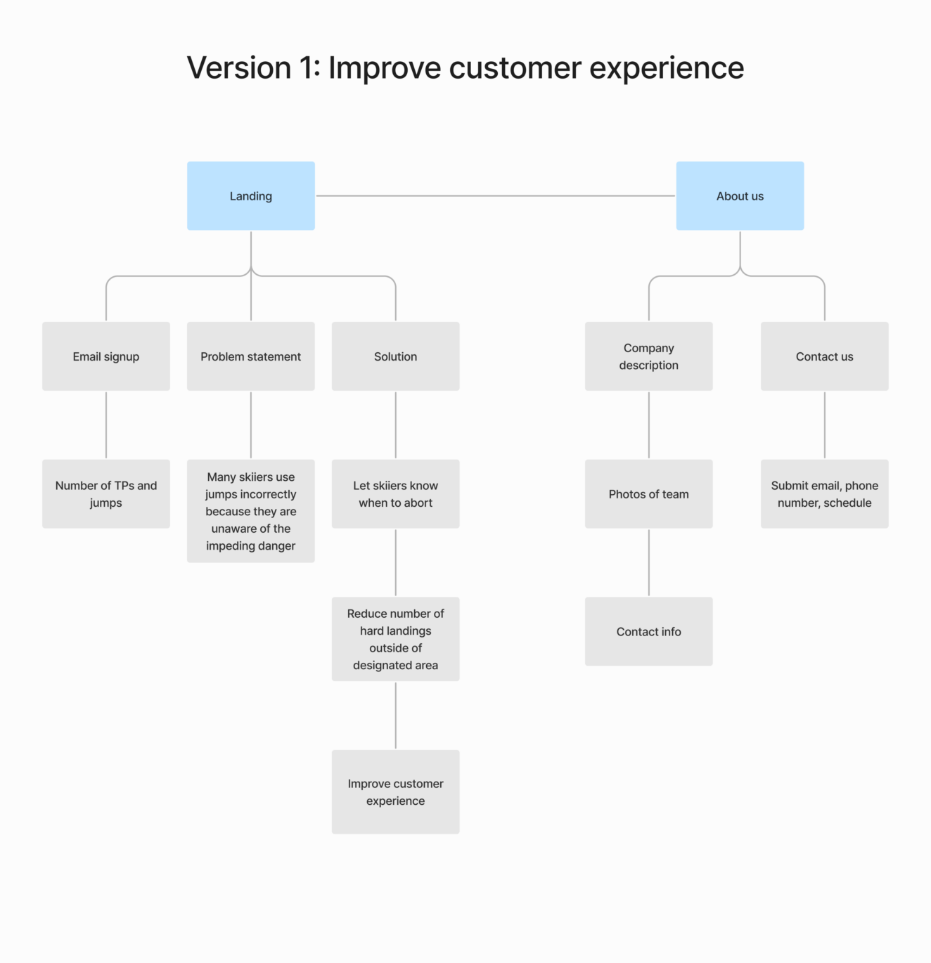
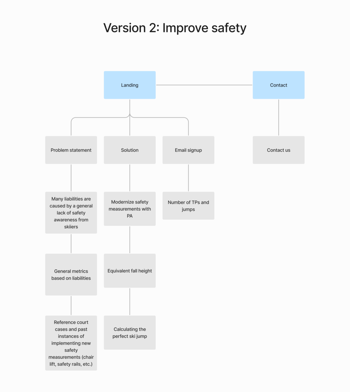
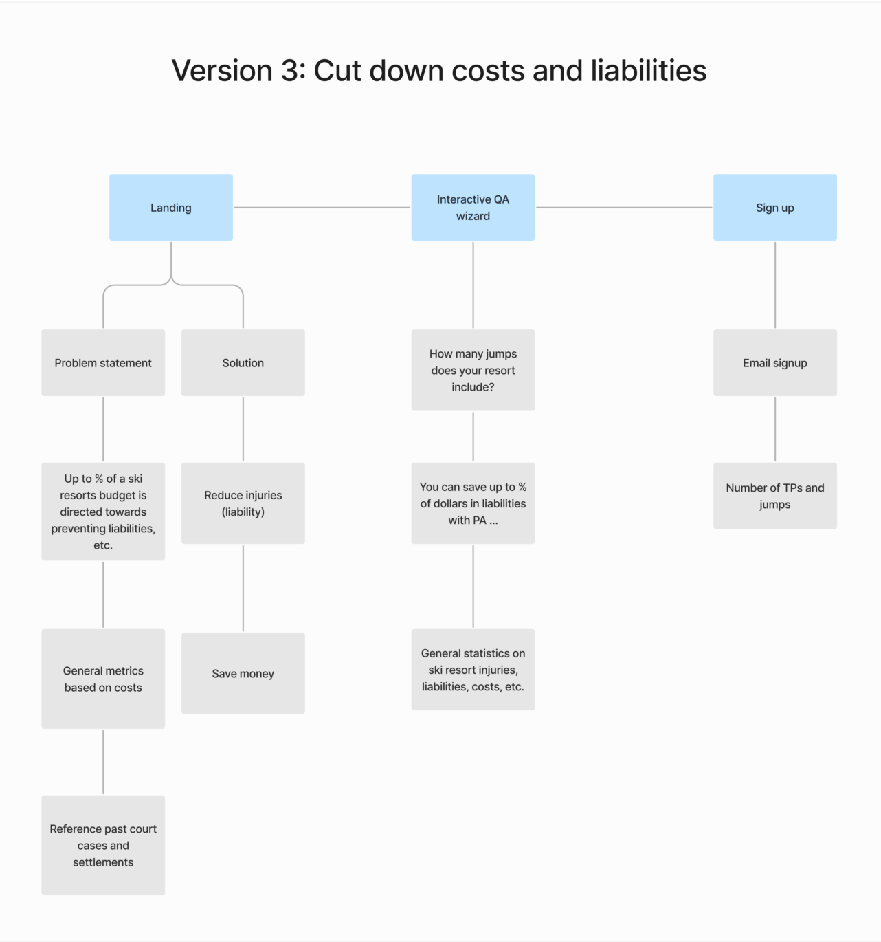
Here’s an example of the process in which we created three different sitemaps for a single marketing page can help clients figure out what their main goals are for their product.
Going back to square one: continuous information architecture evaluation
As for most aspects of design, it’s essential to emphasize the importance of ongoing evaluation and refinement. Your app’s information architecture is not a one-time task you check off and move on from but rather a continuous process that evolves alongside user needs, technological advancements, and business goals.
So, to make sure that your IA remains effective, you should regularly solicit feedback from users, conduct usability tests, and analyze analytics to identify areas for improvement. Also, keep up with industry trends and best practices to maintain the relevance of your IA and to make sure it meets the ever, ever-evolving demands of users.
Tying it all together
Mastering information architecture is the key to crafting digital products that truly resonate with users while driving business outcomes. By prioritizing user needs, organizing content logically, and designing clear navigation pathways, you can create intuitive and effective user experiences.
However, it’s not a one-time task. IA requires ongoing evaluation, refinement, and adaptation to keep up with the ever-evolving digital landscape. By adopting a user-centered approach and staying on top of industry trends, you can create robust information architecture frameworks that enhance usability, foster engagement, and elevate the overall quality of digital products.
So, with a commitment to continuous improvement, you can confidently navigate the complexities of IA and deliver digital experiences that leave a lasting impact on users. Don’t settle for mediocre results; prioritize IA and take your digital products to the next level.
Written by Brandon Ramos, one of Goji Labs’ rockstar product designers. Want some help or advice with UX design? Reach out to us—we’d love to talk 🙂